

PROTECT YOUR DNA WITH QUANTUM TECHNOLOGY
Orgo-Life the new way to the future Advertising by AdpathwayI’ve been taking photos professionally for over thirty years, and for as long as my cameras have had a histogram, it’s been the one camera readout I check on almost every shoot. It has saved more of my photos than any other feature on any camera I’ve owned, and it’s also, by some distance, the least understood thing on the back of one.
Here’s the answer up front, because you shouldn’t need a thousand words of theory before someone tells you what the graph means. A histogram shows the brightness of every pixel in your photo, from pure black on the left to pure white on the right; the taller the graph at any point, the more pixels sit at that brightness.
The three-second read is this: if the graph piles up hard against either edge, you’re losing detail to pure white or pure black. Everything else about the shape is a description of your scene, and there is no shape it’s supposed to be.
If you’ve ever pulled up that wiggly mountain range on the back of your camera, nodded thoughtfully, and carried on shooting with no real idea what it was telling you, you’re in good company. Most photographers I teach can find the histogram. Far fewer can look at it and know what to change before the next frame, and that second part is the actual skill. Closing that gap is what this guide is for.
Every example image below is one of my own photos shown alongside its real histogram, captioned with the camera, lens and settings that made it. I still shoot a Canon EOS R5, so that’s the camera you’ll see in the on-camera sections, but everything here applies to any camera with a histogram display, which these days is nearly all of them, phones included.
What a Histogram Actually Shows
A histogram is a bar chart of brightness. Your camera takes every pixel in the image, sorts them from darkest to brightest, and stacks them into columns: shadows on the left, midtones in the middle, highlights on the right. That’s the entire trick. My R5 produces files of around 45 million pixels, so the graph you see is a census of 45 million votes on how bright the photo is.
The scale it’s drawn on runs from 0, pure black, to 255, pure white. That’s the 8-bit convention cameras and editors use to display the picture, rather than anything to do with what your raw file records underneath. Keep that distinction in the back of your mind, because it matters later.
What the histogram doesn’t have is an opinion. It doesn’t know whether you photographed a polar bear in a snowstorm or a black cat in a coal cellar, and it will draw wildly different graphs for each while being perfectly content with both. The histogram describes your scene. It doesn’t judge your exposure. Keeping hold of that idea will save you from the most common histogram mistake, which we’ll get to shortly.
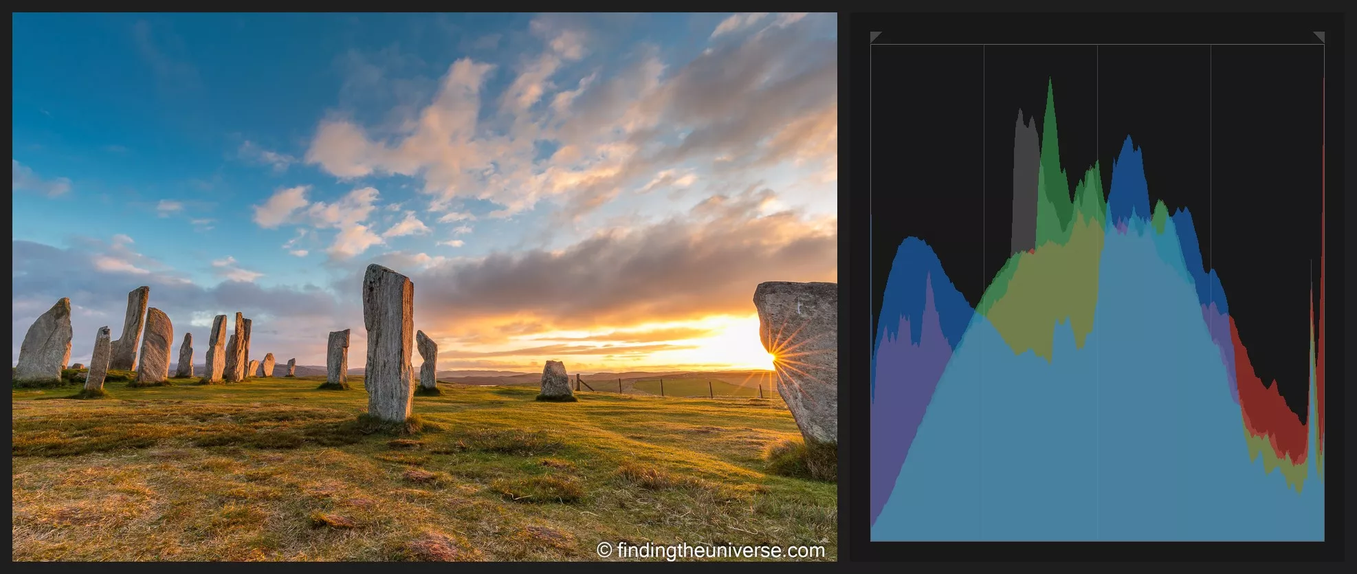
How to Read the Shape
The edges of the graph tell you what you’re losing, and the position tells you where the light in your photo sits. Those are the two things to look at, in that order: edges first, position second.
Here’s what the common shapes mean, and what I’d actually do about each one:
| Piled against the right edge | Blown highlights: areas of pure white with no detail recorded | Reduce exposure, unless what’s clipping is a light source or a reflection |
| Piled against the left edge | Blocked shadows: areas of pure black with no detail | Increase exposure if you want that shadow detail; leave it for silhouettes and night scenes |
| Hump sitting left of centre | A dark image, or a dark scene | Ask whether the scene really was dark. If yes, it’s correct. If no, add exposure |
| Hump sitting right of centre | A bright image, or a bright scene | Same question in reverse. Snow and sand should sit right |
| Narrow clump in the middle | Low contrast: flat, even light with no true blacks or whites | Usually fine out of camera; contrast is easy to add in post |
| Stretched across the full width | A high contrast scene using the sensor’s whole range | Check both edges carefully; you may be close to clipping at either end |
Notice how many of those rows end in a question rather than an instruction. That’s the histogram being a description rather than a rulebook, and it’s why the edges matter more than the hump: the middle of the graph needs interpreting, but the edges are facts.
Clipping: The Part Your Eye Can’t See
Clipping is when pixels get pushed past the ends of the scale, to pure white (blown highlights) or pure black (blocked shadows). On the histogram it shows up as a spike climbing the edge of the graph, as if the data is trying to escape. Once a highlight is blown in the file, that detail is gone. No slider in any editor will bring back texture that was never recorded, which is why the right edge gets most of my attention.
Shadows are more forgiving. A modern sensor keeps a surprising amount of recoverable detail in the dark end, particularly if you shoot raw, so a left edge spike is a problem you can often fix later. A right edge spike usually isn’t.
But, and this matters, not every clipped highlight is a mistake. The glint of sun on water, a chrome bumper, the sun itself in a sunset, a street lamp at night: these are all supposed to read as pure white. It’s a light; it’s allowed to look like one. Chasing detail into them flattens the whole photo. Judge clipping by what’s clipping, and by whether anyone would ever expect to see detail there.
There Is No Perfect Histogram
There’s no shape a histogram should be, and anyone telling you to aim for a tidy hill in the middle of the graph is setting you up to ruin your best photos. This is the myth that does the most damage, so I’d rather prove it than just say it.
Below are two photos of mine. Both are exposed exactly as I wanted them. Their histograms could hardly be more different.
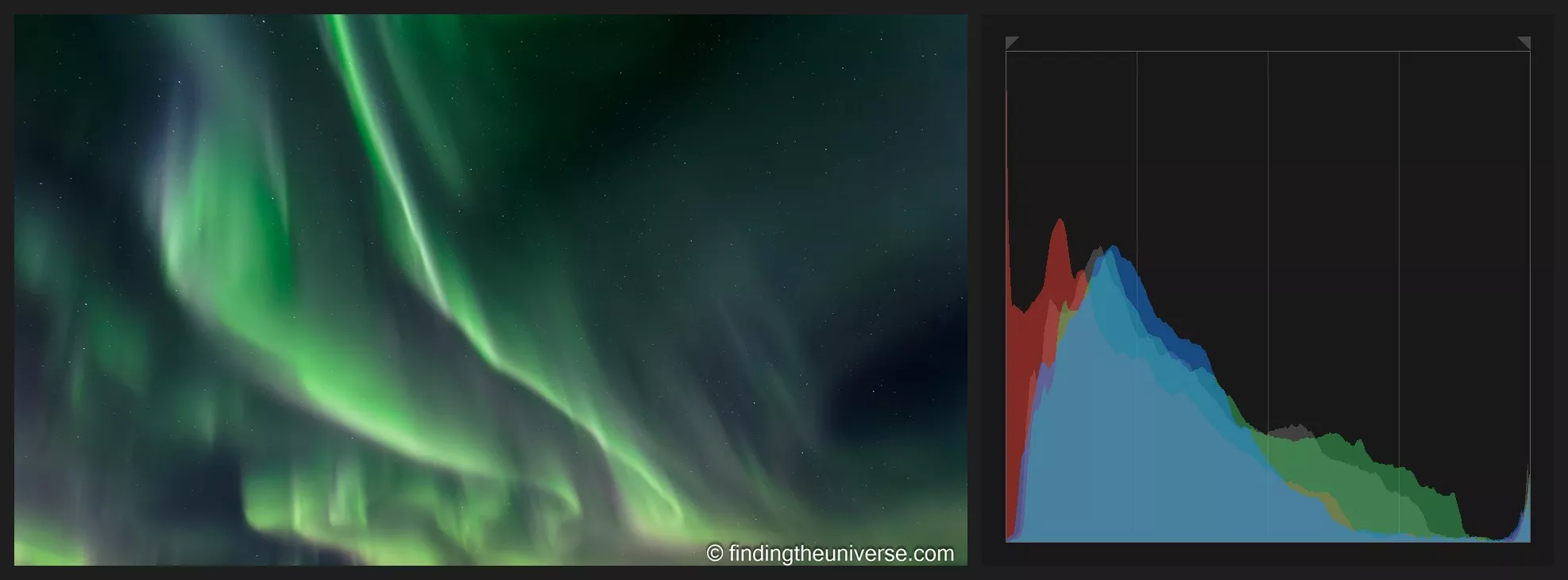 The northern lights. Canon EOS 6D, EF 17-40mm f/4L at 19mm, 4 sec, f/5, ISO 2000. Night is dark, so the histogram piles up against the left edge. There is nothing to fix; the graph is describing the scene correctly.
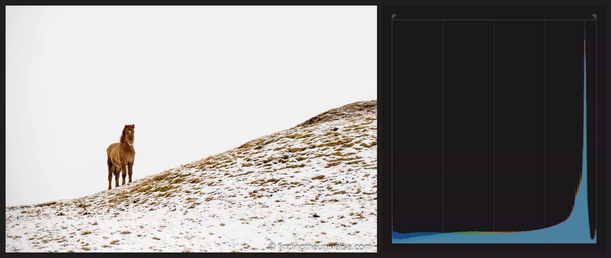 An Icelandic horse on a snowy hillside. Canon EOS 6D, EF 70-200mm f/2.8L at 100mm, 1/1250 sec, f/3.5, ISO 100. Snow is bright, so the graph piles hard to the right and stops just short of the wall, which is exactly where it belongs.
The night shot’s histogram is crammed into the left third, which is correct, because night is dark. The snow scene is crammed into the right, which is also correct, because snow is bright. If I’d “fixed” either of them toward the middle, the night sky would look like dusk and the snow would look like wet cement. The histogram was accurate in both cases. It was describing two scenes that don’t look anything alike, and doing it well.
So ask a different question. Does the histogram match the scene in front of you? If the scene is dark and the graph sits left, you’ve exposed it correctly, whatever the shape looks like. That reframe is most of the skill, and the rest of this guide is about applying it.
Reading the Histogram on Your Camera
On most cameras the histogram lives in two places: over your image in playback, and, on mirrorless bodies, live in the viewfinder or rear screen before you take the shot. That live version is quietly one of the best reasons to shoot mirrorless, because you can see an exposure problem before you make it rather than after. Our guide to using a mirrorless camera covers setting up your displays, along with everything else worth changing out of the box.
On my R5, Canon gives me two versions to choose between: [Brightness], a single graph of overall luminance, and [RGB], three graphs showing the red, green and blue channels separately. I’d suggest RGB if your camera offers it. A saturated sunset or a red flower can clip one colour channel while the overall brightness still looks safe, and the RGB view is the only place you’ll see that happening.
Canon also has a separate playback setting called [Highlight alert], which makes blown areas blink during playback. Photographers call these “the blinkies”, and they’re the histogram’s blunt-instrument sibling: less information, much faster to read. I keep them switched on. The histogram tells you how much is clipping; the blinkies show you exactly where, so you can decide whether you care. A blinking sun: fine. A blinking bride: less fine.
The JPEG Trap: What Your Histogram Isn’t Showing You
Now for the caveat that took me embarrassingly long to learn myself. On almost every camera, the histogram and the blinkies are built from the JPEG preview the camera renders using your current picture style, even when you’re shooting raw. That means contrast, saturation, white balance and settings like Canon’s Highlight Tone Priority all shift the graph. Shoot the same scene with a punchy high-contrast picture style and a flat one, and you’ll get two visibly different histograms from identical raw data.
The practical consequence is that the camera’s histogram is conservative. It shows clipping a little before your raw file has actually clipped, so there’s usually a bit more highlight detail in the file than the graph suggests, often somewhere around a stop, though it varies by camera and settings.
If you shoot raw and want the histogram to track the file more closely, set a flat or neutral picture style; the graph will never perfectly match the raw data, but it gets usefully close. And if you’re not sure what raw is or whether you should be shooting it, our guide to raw in photography answers that one in full.
None of this makes the camera histogram useless, of course. It errs in the safe direction. Just know that when it shows a whisker of highlight clipping, your raw file has probably still got it covered.
Where to Find the Histogram: Canon, Sony, Nikon and Fuji
Fair warning: I shoot Canon, so the Canon instructions come from my own thumbs and the rest are researched rather than lived. Menu layouts also move between models and firmware versions, so treat these as pointers, and give your manual a minute if a button doesn’t do what I’ve said.
On Canon bodies, cycle the playback displays with the INFO button until the histogram view appears; the choice between the [Brightness] and [RGB] graphs lives in the playback menu, though on recent mirrorless bodies like my R5 you switch between the two with a further INFO press while the histogram’s on screen. On Sony bodies, it’s the DISP button during playback that cycles you through to the histogram screen.
On Nikons, you scroll through the playback displays with the up and down of the multi selector, though you may first need to switch the histogram display on under the playback display options. And on Fujifilm cameras, the DISP/BACK button cycles the playback views, with most recent bodies also offering a live histogram in the electronic viewfinder.
Whichever brand you’re holding, the five minutes it takes to find this screen, and on a mirrorless camera to add the live histogram to your shooting display, is quite possibly the best five minutes you’ll ever spend in your camera’s menu system. Admittedly a low bar.
The Three-Second Field Check
In the field, the histogram check I run is three seconds long: edges, position, done. Here’s the sequence, in the order I actually do it.
First, the edges. Is there a spike climbing either end of the graph? If yes, is the thing that’s clipping something I care about? A clipped street lamp gets ignored; a clipped sky gets fixed.
Second, the position. Does the graph sit where the scene says it should? A bright beach scene sitting right of centre is correct. A bright beach scene sitting in the middle means my camera’s meter has been fooled, and the sand is going to come out grey.
Third, the fix, which is almost always the exposure compensation dial. I shoot in aperture priority nearly all the time, so the camera picks the base exposure and I nudge it: a third of a stop down to rescue a highlight, a full stop up to keep snow white. If that workflow is new to you, my guide to aperture priority mode walks through the whole thing, exposure compensation included. Give it a few outings and the whole check becomes automatic!
One more field habit worth stealing: trust the histogram over the picture on your screen. The image on your LCD changes its apparent brightness with the ambient light, your screen brightness setting, and the angle you’re holding the camera at. In bright sunshine everything looks dark; reviewing photos at night, everything looks bright and gorgeous and then turns out underexposed at your desk the next morning.
The histogram doesn’t care about any of that. The graph is the same graph at noon and at midnight, which is why it’s the readout I trust.
Landscapes and Bright Skies
In landscape photography the histogram has one job above the others: guarding the right edge. Skies clip long before the rest of the frame looks wrong, because the sky is often several stops brighter than the land beneath it. On the back of the camera the shot looks fine; at home, the clouds are a sheet of white paper. I’ve been caught by this on shoots I should have known better on, which is why the right edge check is a reflex for me now.
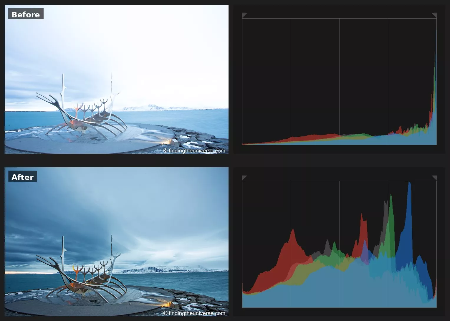 The Sun Voyager (Sólfar), Reykjavík. Both frames: Canon EOS 6D, EF 17-40mm f/4L at 17mm, f/11, ISO 100. Top (+2⅔ EV, 13 sec): the sky blows to blank white and the graph spikes the right edge. Bottom (+1⅓ EV, 5 sec): a stop and a third less exposure holds the cloud and mountains, and the right edge lets go of the wall.
The fix in the field is to expose for the sky and accept a darker foreground. Watch the right edge as you dial exposure compensation down, stop when the spike lets go of the wall, and let the land go a bit murky, because that’s the recoverable end of the file. We’ll pull those shadows back up in the post-processing section, and the result beats a clipped sky every time.
While we’re at the bright end of the graph, you’ll sooner or later run into the technique called exposing to the right, or ETTR. The idea: because sensors record more tonal information in the brightest stops, you deliberately push your exposure as bright as it will go without clipping, then pull it back down in post, and your shadows come out cleaner for it.
It’s a real technique with a real benefit, and it comes with two caveats. Push a touch too far and you clip highlights you can’t get back, which is an expensive way to save a little shadow noise. And on modern sensors the benefit has shrunk; cameras have got so clean in the shadows that ETTR is now an optional discipline for demanding scenes rather than something to practise on every frame.
I use it for tripod landscape work when I have time to be careful, and I don’t lose sleep over it the rest of the time. Remember too that the camera’s histogram is conservative, so true ETTR is judged on the raw file, which has a little more room than the graph admits to.
If a scene won’t fit within the histogram no matter what you do, bracketing is the escape route: several frames at different exposures, blended later, and a subject for another day. For the wider craft of this kind of shooting, our guide to landscape photography is the place to go next.
High Contrast Scenes: When the Histogram Can’t Win
Sometimes the histogram stacks up at both ends at once: a spike of blocked shadows on the left, a spike of blown highlights on the right, and no exposure compensation in either direction that fixes one end without wrecking the other. A dim room with a bright window. A sunset with dark cliffs in the foreground. This is the graph telling you the scene holds more contrast than your sensor can record in a single frame, and no setting will change that.
What you do have is a choice about what to lose, and the rule I shoot by is to expose for the highlights. Blown highlights are gone for good, while blocked shadows on a modern sensor will lift back up in post with usable detail, at the cost of a little noise. So I set the exposure so the right edge behaves, let the foreground fall dark, and fix it later. It feels wrong on the back of the camera, and it’s right in the file.
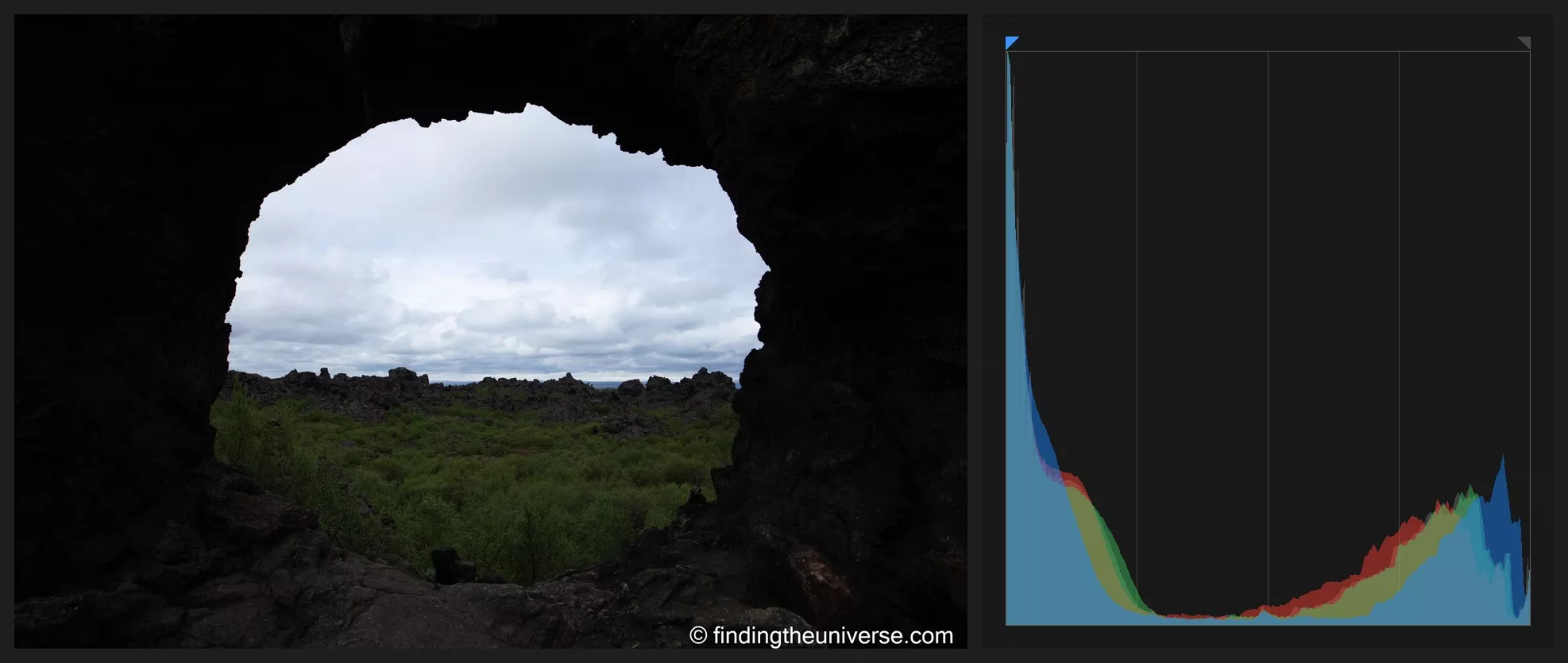 Looking out through a lava arch at Dimmuborgir, Iceland. Canon EOS 6D, EF 17-40mm f/4L at 21mm, 1/250 sec, f/9, ISO 100, -2 EV. Exposed for the bright sky, so the lava falls dark and the shadows pile against the left edge. That detail is recoverable, as the Lightroom example below shows.
The Histogram in Lightroom
Once you’re at your desk, the histogram becomes trustworthy in a way the camera’s version never quite manages, because your editor draws it from the file you’re actually editing: what the graph shows is what you’ll export. In Lightroom Classic, which is where I do my editing, it sits at the top of the right-hand panel in the Develop module and updates live as you move any slider.
The feature to learn here is the clipping overlay. In the top corners of the histogram panel are two small triangles: the left one for shadow clipping, the right one for highlights. Click a triangle to switch its overlay on, or just press J to toggle both at once.
With the overlays on, Lightroom paints blown highlights red and blocked shadows blue directly onto your image, so instead of guessing from the graph, you can see exactly which pixels are past the edge. That behaviour has been in Lightroom Classic for years and is unchanged in the current 2026 release; Adobe’s Lightroom Classic documentation covers it alongside the rest of the Develop module.
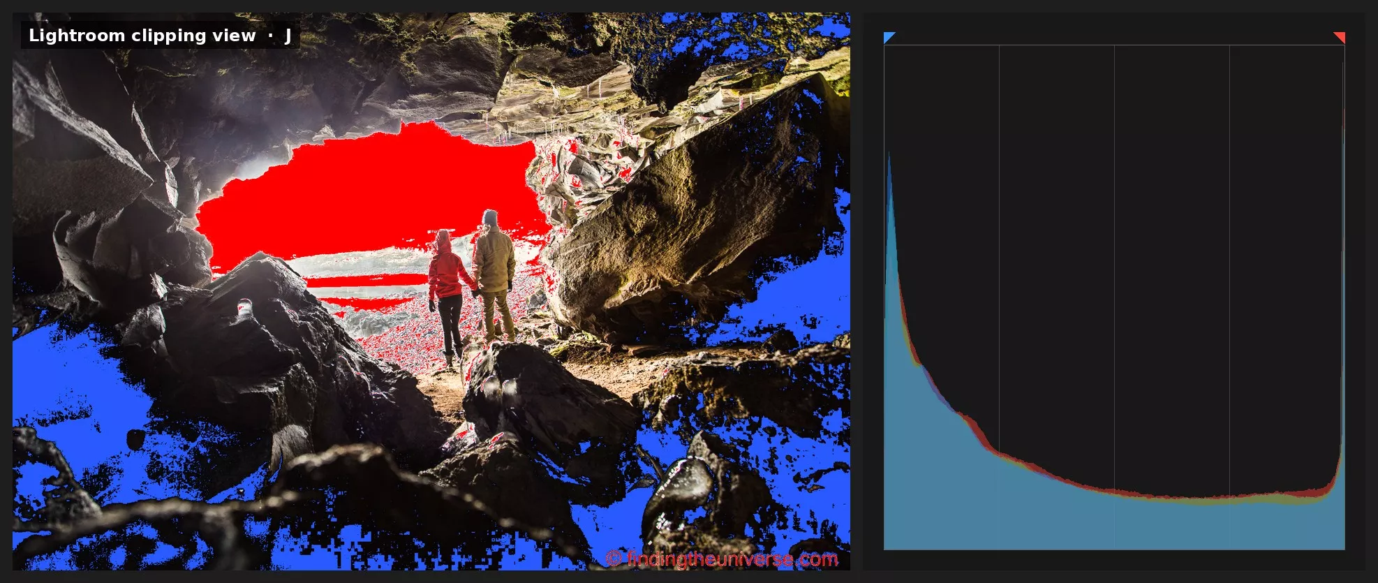 Lightroom’s clipping overlay (press J) on a high-contrast cave mouth near Hellnar, Iceland. Red marks blown highlights in the bright opening; blue marks blocked shadows in the cave walls, with the histogram’s corner triangles lit to match. Canon EOS 6D, EF 17-40mm f/4L at 19mm, 1/80 sec, f/6.3, ISO 320, +2 EV.
This is also where the dark-foreground discipline from the last two sections pays off. Take the sunset I exposed for the highlights: in Lightroom I raise the Shadows slider, watch the left side of the histogram walk in from the edge, and the cliffs that looked like a silhouette on the back of the camera come back with colour and texture in them. A raw file holds far more of this recoverable shadow detail than the camera’s screen ever let on.
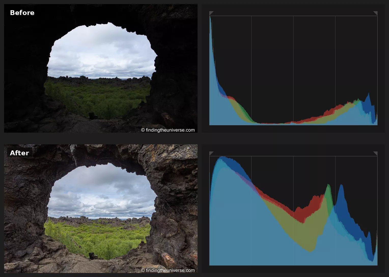 The same Dimmuborgir frame, before and after raising the Shadows slider in Lightroom. Top: straight off the card, the lava arch is near-black and the graph spikes the left edge. Bottom: with the shadows lifted, the rock texture returns and the left edge walks in from the wall. Both from the one raw file.
That’s the full loop: protect the right edge in the field, then spend the file’s shadow headroom at your desk. Once it clicks, the histogram stops being an abstract graph and becomes the thing connecting the two halves of your photography.
When to Ignore the Histogram
The histogram describes your scene; it was never a target. So the final skill is knowing the situations where a lopsided graph is the correct graph, and where “fixing” it would ruin the photo. There are more of these than you might think.
Snow, sand and other high-key scenes should sit well right of centre. Your camera’s meter doesn’t know it’s looking at snow; it aims everything at a middling grey, which is why unattended snow photos come out dull and dingy.
I add positive exposure compensation, usually a stop or so, watch the graph shift right, and stop before the right edge spikes. The histogram’s job here is confirmation: the graph sitting right of centre tells me the correction landed, and the clean right edge tells me I didn’t overdo it.
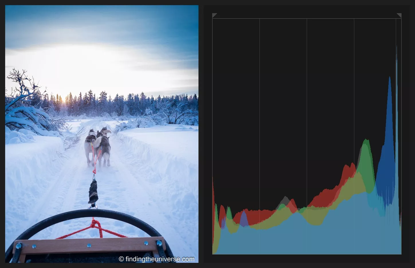 Husky sledding in Finnish Lapland. Panasonic Lumix DMC-G6, 14-42mm at 17mm, 1/200 sec, f/5.6, ISO 160, +2 EV. Two stops of positive exposure compensation push the bright snow where it belongs, hard to the right, with only the low sun touching the edge.
Night scenes are the mirror image. A histogram crammed into the left third is what midnight looks like, and dragging it toward the centre gives you that washed-out, dusk-at-best look that flat night photos have. Let it sit left; just check the highlights, because street lamps and neon will clip, and mostly that’s fine, they’re lights. The histogram is at its most useful at night, when your dazzled eyes and a bright LCD are at their least trustworthy.
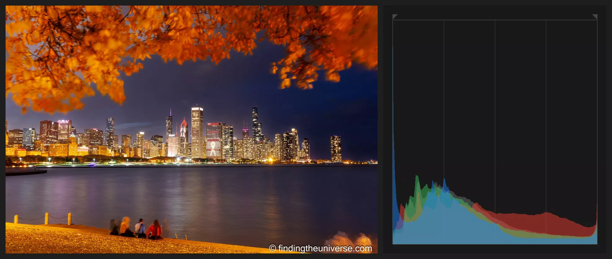 Chicago’s skyline at blue hour, framed by autumn leaves. Canon EOS R5, EF 16-35mm f/4L at 33mm, 30 sec, f/8, ISO 100. The scene sits left, and the city lights trail off to the right; the lit windows and street lamps clip to white, which at night is exactly right.
Silhouettes are a deliberate left edge spike: you’re choosing to let your subject go pure black against a bright sky, and the histogram will dutifully report an enormous shadow clipping problem. It’s reporting your intention. Carry on.
The pattern across all three is the same. Expose for the photo you want, and use the histogram to confirm you’re getting it deliberately rather than by accident. An intentional lopsided histogram is a photographer making a decision. An accidental one is the camera making it for you.
Frequently Asked Questions
What Should a Histogram Look Like?
There’s no shape a histogram should be. The graph describes the brightness of your scene, so a dark scene correctly gives a left-heavy graph and a snow scene correctly gives a right-heavy one.
The only check that applies to every photo is the edges: a spike climbing either end means clipping, and the question to ask is whether you meant it.
Which Side of the Histogram Is Dark and Which Is Bright?
The left side is dark and the right side is bright, on every camera and in every editor. The far left is pure black, the far right is pure white, and everything between is the run of midtones.
If the graph piles up against the left wall you’re losing shadow detail; against the right wall, highlight detail.
Should I Use the Brightness or the RGB Histogram?
RGB, if your camera offers it. The brightness histogram averages everything into one graph, which can hide a single colour channel clipping. That’s exactly what happens in sunsets and with saturated flowers: the red channel maxes out while the overall brightness still looks safe. The RGB view shows each channel separately, so you catch it in time.
Does the Histogram Show My Raw File?
No. On almost every camera, the histogram is drawn from the JPEG preview rendered with your current picture style, even when you shoot raw, so the raw file usually holds a little more highlight detail than the graph suggests.
Setting a flat or neutral picture style makes the histogram track the raw file more closely.
Does the Histogram Work at Night?
Yes, and night is when I trust it most. Your eyes adapt to the dark and the camera’s screen looks misleadingly bright, so photos that look great at midnight often turn out underexposed. The histogram isn’t fooled by any of that.
Expect a left-heavy graph for a night scene, and don’t fight it; that’s what night looks like. Clipped street lamps and neon signs are normal and fine.
What Is Clipping in a Histogram?
Clipping is when pixels are recorded as pure white (blown highlights) or pure black (blocked shadows), with no detail in them. It appears as a spike against either edge of the histogram.
Blown highlights can’t be recovered in editing, while blocked shadows often can be, at least partly, especially from a raw file. That asymmetry is why most photographers protect the highlights first.
Should I Use the Histogram or the Highlight Alert (Blinkies)?
Both, because they answer different questions. The histogram tells you how much of the image is clipping and how the exposure sits overall; the highlight alert shows you exactly where the blown areas are, blinking on the image itself.
I keep the blinkies on for a fast check of what’s clipping, and read the histogram when I’m deciding how far to push an exposure.
Going Further
That’s the histogram: a graph of your pixels, a guard on your highlights, and, once you stop treating it as a score to optimise, the most useful readout on your camera. I still glance at it on nearly every shoot, which is about the strongest recommendation I can give a feature.
If you’d like to take this further, my online travel photography course covers exposure from the ground up, histograms included, with worked examples and personal feedback on your photos as you go. It’s the fastest route I know from understanding an idea like this one to using it without thinking.














 English (US) ·
  French (CA) ·