
 7 months ago
182
7 months ago
182
Have you ever walked into a venue and thought, “This place already looks like a poster”? Snap-to-scene flyers take that exact magic and put it on paper—designing visuals that echo the same mood, color palette, textures, and quirks of the location where your event will happen. Whether it’s the breezy gradient blues of a midnight beach party or the soft green typography of a park picnic, these flyers feel like they belong to the space.
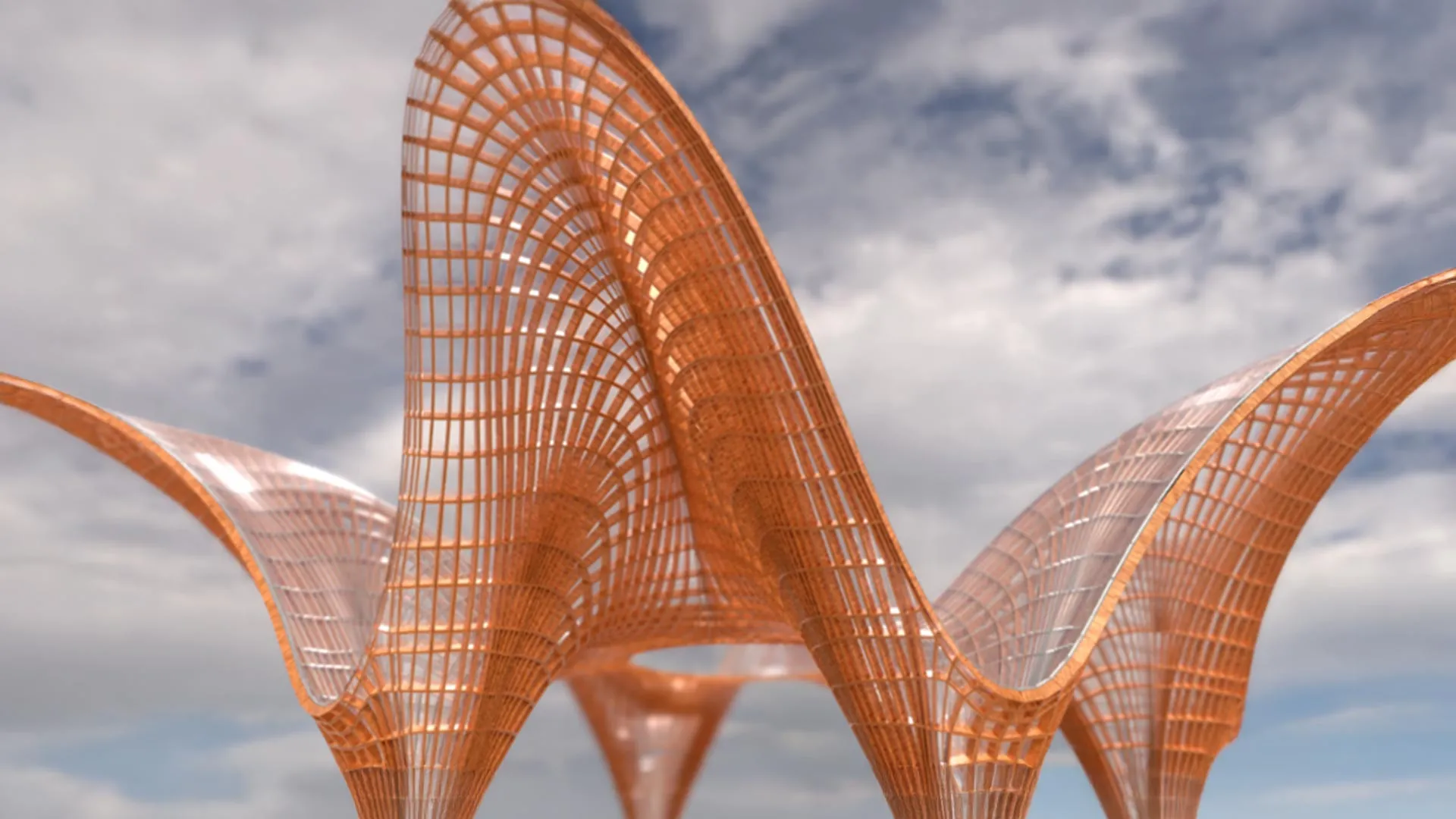
Snap-to-Scene AI Image Generator
Thanks to modern tools such asAI image generators, anyone can create these precise, venue-coded visuals without being a full-time designer. In this guide, we will create a flyer from scratch using Dreamina’s creative workflow, and by the end, you should have a concept that looks like it came directly from the venue.
Why location-coded visuals hit differently
When people see a flyer that mirrors the real event’s environment, they immediately recognize it. It’s almost like the brain says, “This feels familiar—I want to be there.”
Here’s why this approach works so well:
- It creates a sense of anticipation, allowing them to preview the atmosphere.
- It reduces visual noise because the viewer isn’t guessing the theme.
- It creates a micro-brand for even the smallest pop-up.
- It makes your event feel intentional, even if it’s put together at the last minute.
The best part? You don’t have to go out location-scouting for design elements. You need but a streak of imagination—and a clear prompt.
Reading the venue’s personality
Before you design, you need to know the “identity” of the place. Think of places as storybook characters. A park isn’t just a park – it may be:
A chalky pastel morning park
- A deep-shadowed, mossy old-forest park
- A vibrant, sun-drenched picnic-perfect park
Equally, a café would be:
- Indie beige aesthetics with scrawled, handwritten menus
- Neon-lit dessert café with glossy surfaces
- boho, plant-heavy, wooden interiors
The trick is to translate physical elements into visual motifs:
- Textures -> paper grain, background patterns
- Lighting -> gradients, shadows
- sounds -> typography mood
- crowd -> illustration style
- Colors: accent strokes and filters
The moment you train your eye to notice details, the flyers start to feel alive.
Using motion to match the mood
Even though flyers are static, thinking in motion helps you design better. Think of how the air moves in the venue. A beach? Slow drifts. A museum? Stillness. A night market? Fast glints of color. This is also where creators sometimes use an AI video generator to test moodboards by generating short, looping ambience clips. The motion will help you pick the right textures and color transitions for your final static flyer. It’s not obligatory, but it enhances your intuition, especially when faced with gradient-heavy or lighting-sensitive designs.
Turning venue vibes into visual elements
Here’s how different types of spaces translate to flyer features:
Parks
Think soft greens, handwritten fonts, leafy silhouettes, cloudy overlays, sunlight-kissed gradients.
Beaches
Sandy textures, turquoise fades, wave-edge borders, playful curved typography.
Cafés
Warm browns, condensed fonts, small illustrated objects (latte cups, pastries), grainy textures for warmth.
Rooftops
Bold lines, night sky blues, geometric iconography, slightly neon or luminous accents.
Night markets
Color pops, sticker-style icons, tight spacing, handwritten elements, spark-style overlays.
Mix and match lightly; don’t overcrowd. Snap-to-scene works best when a single dominant mood guides the design.
From idea to flyer: Dreamina’s 3-step creation flow
Now let’s turn your venue’s atmosphere into a real flyer using Dreamina.
Step 1: Write a text prompt
Visit Dreamina and get started with the most important foundation: the prompt. Set the scene and define the atmosphere you want for the venue, both figuratively and imaginatively. Pay close attention to colors, textures, lighting, and “emotional tone.”
For example:
Create a flyer for a sunset beach pop-up event using soft turquoise-to-peach gradients, gentle wave patterns along the borders, warm, glowing typography, minimal seashell icons, and sandy textures, creating a breezy, relaxed visual atmosphere.
Step 2: Modify parameters and regenerate
With your prompt ready, refine the output by selecting the model, adjusting the aspect ratio to match your flyer shape, setting the size, and choosing either 1k or 2k resolution. Once you’ve dialed in the specifics, click on Dreamina’s icon to generate your artwork. These refinements will help match the venue’s ambiance and deliver crisp, high-quality print results.
Step 3: Customize and download
With the base art ready, enrich it with Dreamina’s AI customization tools: inpaint to fix details, expand to widen the scene, remove to clean clutter, and retouch to refine textures or lighting. Once your flyer is fully aligned with your venue’s energy, click the Download icon to save your final scene-coded design.
Putting the finishing touches offline
A flyer that matches the venue’s personality gets it halfway visually; small manual touches will elevate it further.
Try:
- Paper textures that reflect the vibe: matte for parks, glossy for cafés.
- Border designs are inspired by the location’s shapes and structures.
- Environmental typography: wave-curved letters for seaside events, for example.
- Small pictorial elements, which may suggest the mood.
These touches make your flyer feel even more intentional.
How about an exploration of style?
Some creators experiment with several art styles-flat vector, watercolor, neon, kawaii, brutalist- to determine which best expresses the venue. This is where an AI art generator becomes highly useful, letting you test different aesthetics before committing. You may be surprised by how a style can completely make your venue “feel” on paper.
Wrapping it all up in a scene-perfect bow
Snap-to-scene flyers are more than visuals; they are emotional previews and little postcards of the event’s atmosphere. With Dreamina guiding you from prompt to polish, making a design that looks like it belongs in your chosen venue becomes surprisingly easy and genuinely fun. Whether you set up a beach pop-up, a forest picnic, or a candlelit café meetup, your flyer can whisper the vibe before anyone even arrives.
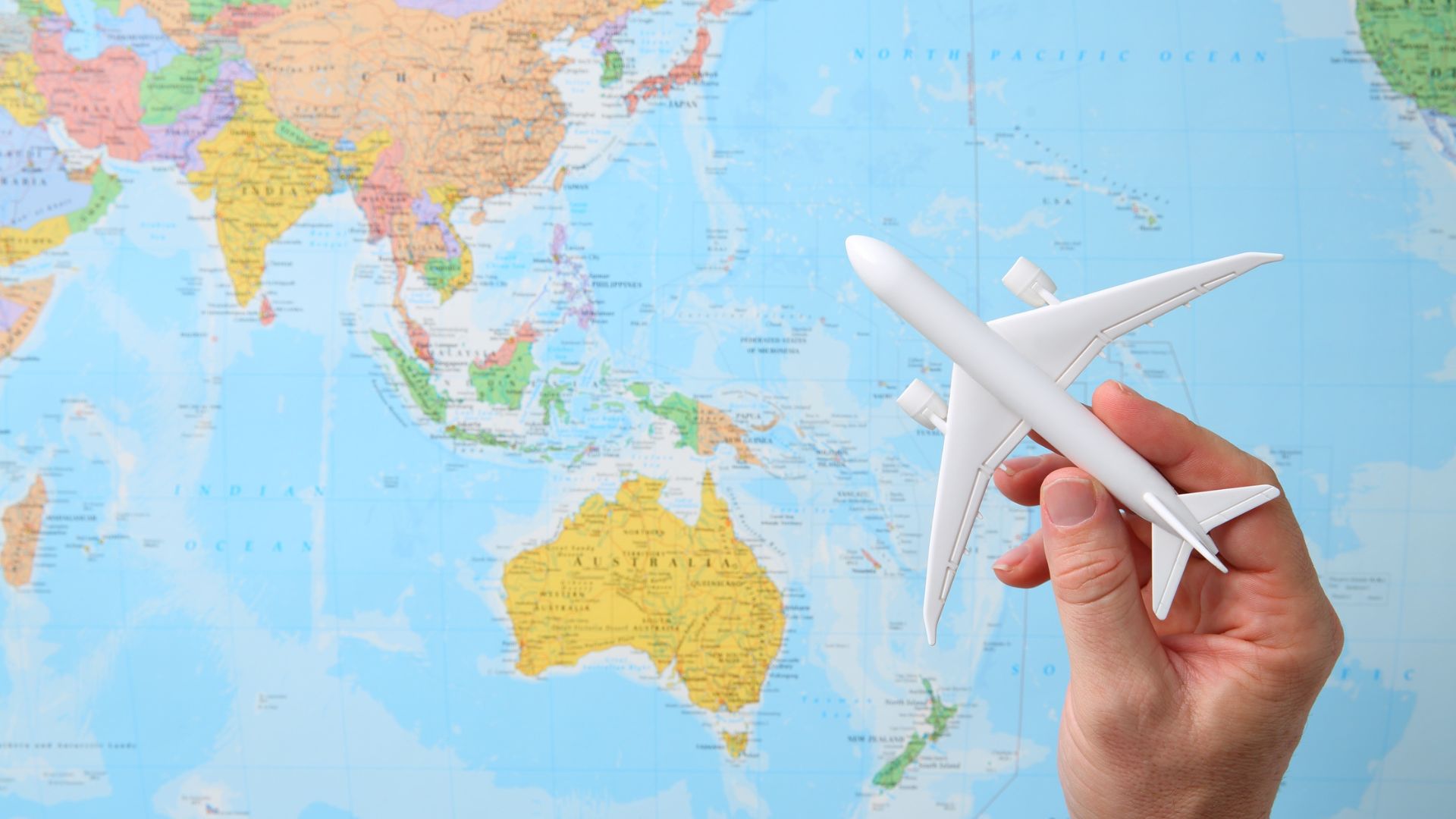
Manila Travel Tour Packages You Should Try
Follow and subscribe to OutofTownBlog.com on Facebook , Twitter, Instagram, Pinterest, and YouTube for more Travel-related updates.
Read: Make Every Pixel Count with CapCut Web’s Transparent Background Maker


 English (US) ·
  French (CA) ·