
PROTECT YOUR DNA WITH QUANTUM TECHNOLOGY
Orgo-Life the new way to the future Advertising by AdpathwayGood data visualizations can help make climate change more visceral and understandable. Back in 2016 Ed Hawkins published a “climate spiral” graph that ended up being pretty iconic – it was shown at the opening ceremony of the Olympics that year – and is probably the second most widely seen climate graph after Hawkins’ later climate stripes.
However, I haven’t previously come across any versions of the spiral graph showing daily global temperatures, so I thought it would be fun to create my own (with, I should note, a bit of help from OpenAI’s o3 model to code it).
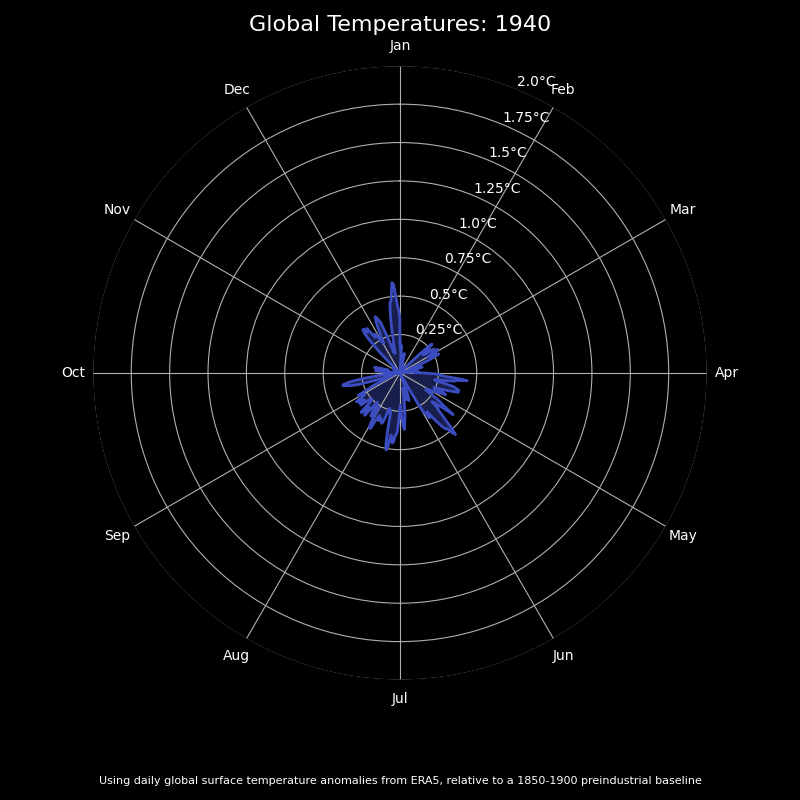
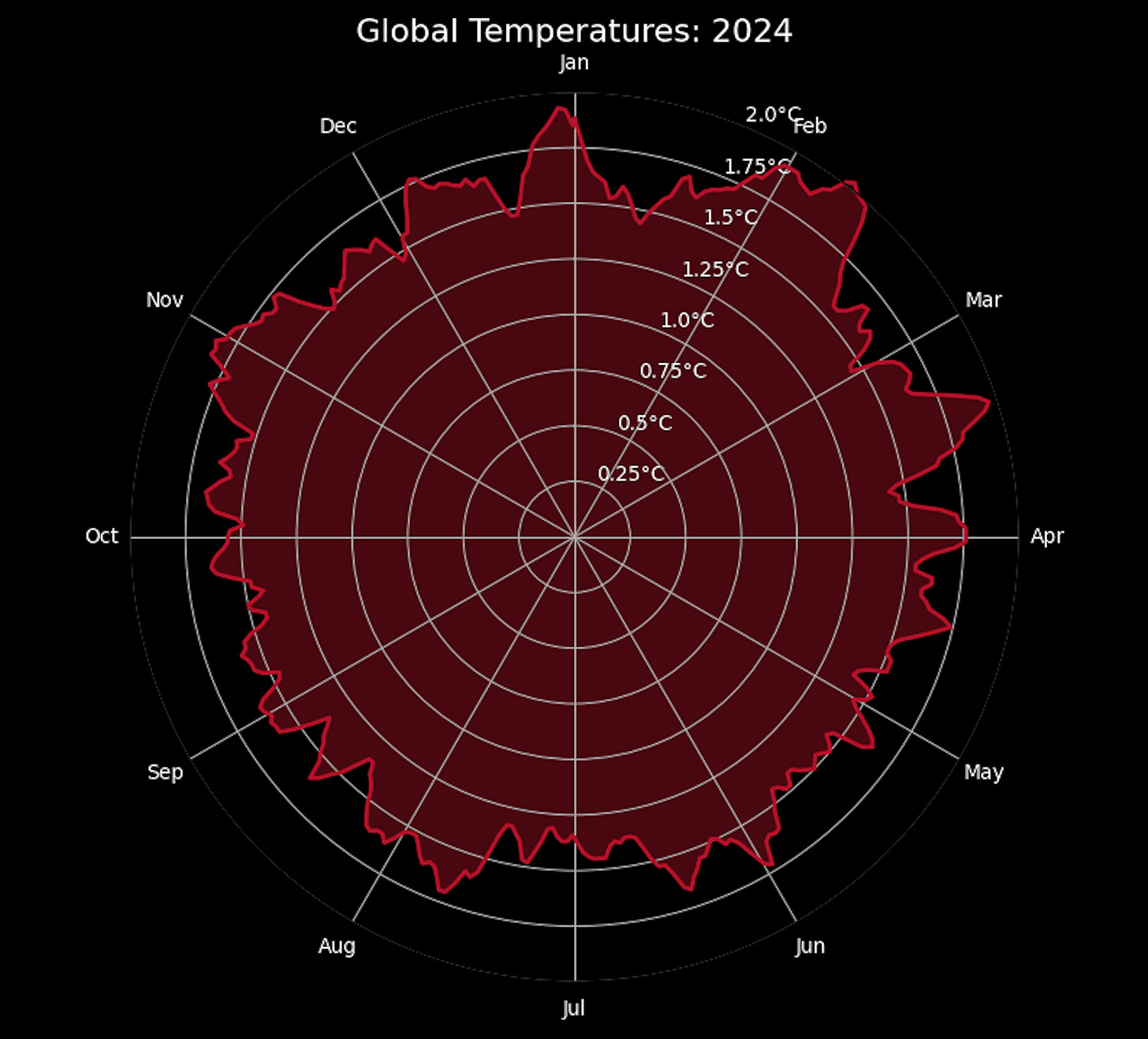
Here are daily global temperatures by year between 1940 (when the ERA5 daily dataset begins) and the end of 2024, with the color varying from blue to red over time.
You can clearly see how anomalous the past few years have been, with a sizable portion of days in both 2023 and 2024 exceeding 1.5C above preindustrial levels:
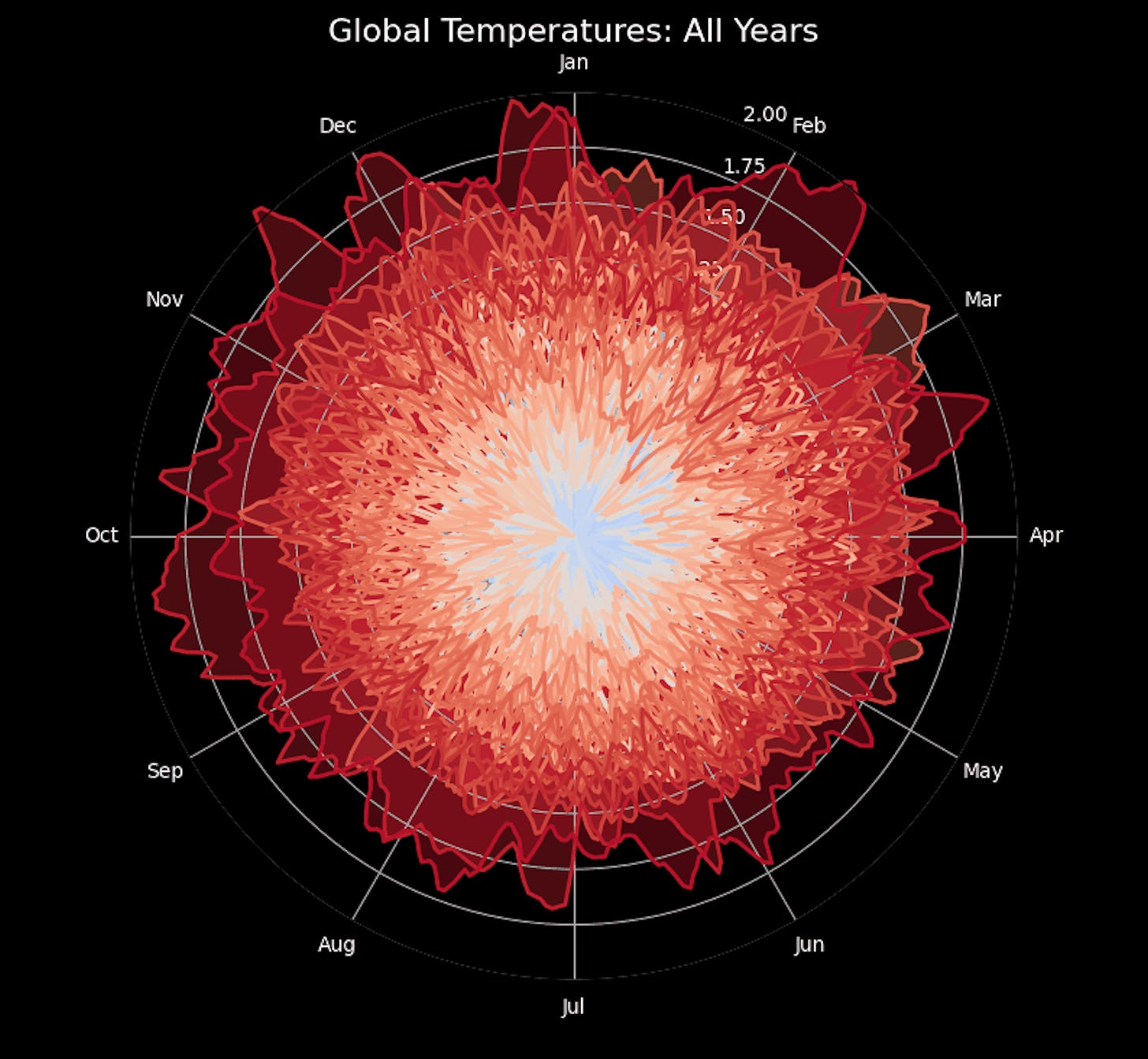
I also quite like how the final frame turned out, when I showed all of the data at once. It looks like a flower, albeit a rather sinister one given whats being displayed!


 English (US) ·
  French (CA) ·